How I worked on my first job at MINE to create better work flows for interior designers and to make it easy to share their interior design with clients.
THE BACKGROUND
MINE provides Furniture and Home Furnishings Manufacturing.
Studio MINE is a holistic website tool made for interior designers to work for clients who need to furnish their homes.
Previously MINE had an initial version of Studio MINE (I would say it was not even version 1.0) - which was equipped with only minimum functionality.
→ MINE was rapidly expanding their business, and there were increasing demands of interior designers to work on their design projects better with clients using Studio MINE. This is why I was hired as the first and only UX designer.
THE TASK
Right after I was hired, I understood my task:
I will create better workflows for MINE interior designers to cut their times, and to easily share their interior design with clients.
But this definition was too vague and I wasn’t even sure where to start.
THE actions
01
Understanding how Studio MINE is being used
First thing I did was to create current User Flows to understand the job process of MINE designers.
Then I conducted both User Interviews and Surveys to dig deep into what they think are the issues.
I picked out all pain points from my surveys, and placed those in the current User Flows.
Doing so it was very clear in which process the problems existed.
User Flows
User Interviews and Surveys
Majority of problems were in the main pages they use most often.
It was surprising to me that users were asking Studio MINE very basic things to do their work (ex. no search bar for projects), and the tool was not even satisfying those humble requirements.
02
Deciding MVPs
With those many issues it was obvious that we had to prioritize those, and would do only MVP features in phase 1.
The user flow with pain points showed us that many of the issues were around project pages and navigations. So it wasn’t difficult for me to triage what were the critical items to be prioritized. I discussed it with the team and we decided the areas to be included in the first phase.
THE PROBLEMS
Navigations are not really helping users, and the menu categories are not well organized.
FIX A
It’s not easy to find and go to the target project.
FIX A
FIX B
It’s hard to share design with clients (have to go back and forth the separate windows)
FIX C
The starting point (landing page) is hidden.
FIX B
UI seems neither professional nor consistent throughout Studio MINE.
FIX D
03
Designing - How we resolved
EXAMPLES OF HOW WE RESOLVED
FIX A
Structured menus and added top & side nav bars
BEFORE (v1.0)
Side nav is sticky and.taking too much spaces
AFTER (v2.0)
Breadcrumbs
Top nav bar
Side nav is hidden
FIX B
Added a new landing page
BEFORE (v1.0)
Initial page was a part of the admin tool and hidden. It wasn’t an easy flow to open Studio MINE
AFTER (v2.0)
New landing page with three CTAs and easy access to recent projects
Added "pick up where I left off"
FIX C
Updated major page structure for easier flow
BEFORE (v1.0)
Moodboard and room page with products are separated. This was forcing designers to switch between the two pages.
AFTER (v2.0)
Added card view and list view to deal with large projects
Combined Moodboard and Room page
Designers can select products while working on Moodboard
FIX D
Applied updated UI to all pages and dialogs
To keep the UI consistent, it was essential to build MINE Design System from scratch. I created the system while working on each file, and applied the new UI to all pages.
EXAMPLES OF MINE DESIGN SYSTEM
Buttons
Typography
Logos & Colors
EXAMPLES OF UI UPDATES
BEFORE (v1.0)
AFTER (v2.0)
Project Page
Room Page
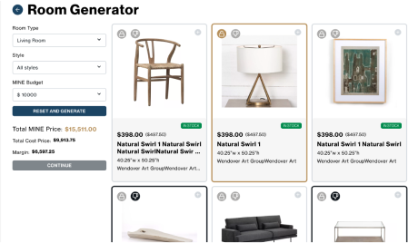
Room Generator
Spotlight
THINGS THAT DIDN’T WORK IN THE FIRST RELEASE
After our first release we had some areas that required follow-up fixes, most of which were UI matters:
4-cards layout was obviously too big, and card sizes were not consistent among different pages.
Needed to update the margin and spacing of each page.
FIRST RELEASE
WE FIXED
THE OUTCOMES
“This is absolutely HUGE. I can't get over how fun Studio MINE is to show now. Congratulations on all the work that made these changes possible.”
VP of Operations at MINE
Happy voices from MINE interior designers
“The improvements are amazing! Makes it much more user friendly.”
“It has such great bones!”
“It is such an improvement to be able to design with the product list below the design board.”
“Adding products is easier to get to.”
“The color and look is sleek and professional!”
“This new version seems to flow really well!”
“Easier to move around portal, finding products is easier, searching by project on designer level is great.”
“The presentation page is really the biggest change. It cuts down the amount of time it takes me to design projects significantly”.
“It looks so great when sharing with clients!”
How much do you think Studio MINE was improved with v2.0?
100%
of users approved the improvement.
How would you rate Studio MINE on a scale of 1 to 10 (10 is the highest)?
8.4
average points
It was 7.14 with v1.0. More than 10% increased.
Score Studio MINE more than 8 (10 is the highest)
28.6% → 80%
It was 28.6% with v1.0. 280% increased.
TAKEAWAY
This was the first major update of Studio MINE and we only worked on the priority items, so the impact was huge for both users and the company.
What I did correctly was to identify the major problems based on research, and I was able to build a foundation of better user flow using new menu bars, new landing page, and new project pages.

.png)